

01
SparkLand
SparkLand
02
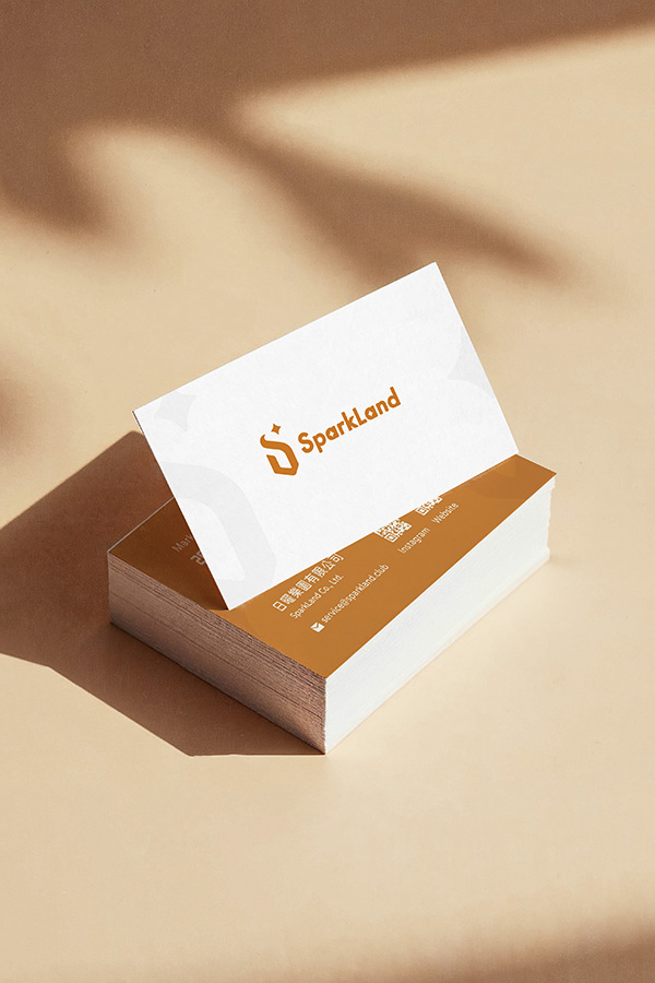
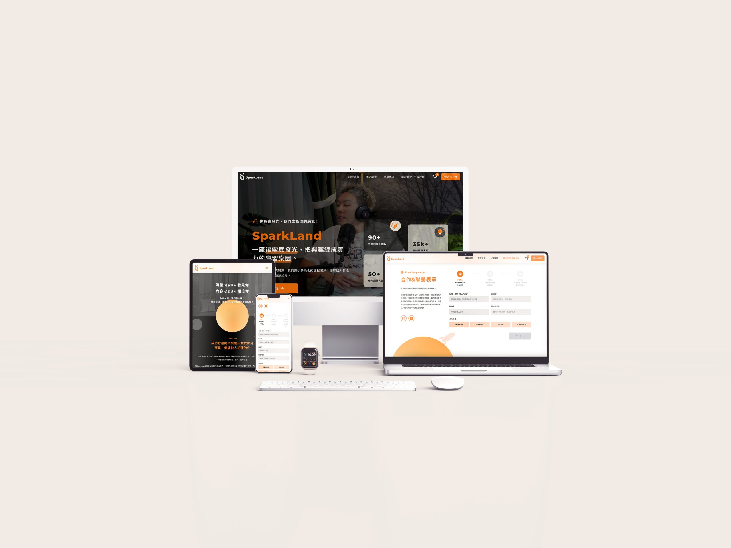
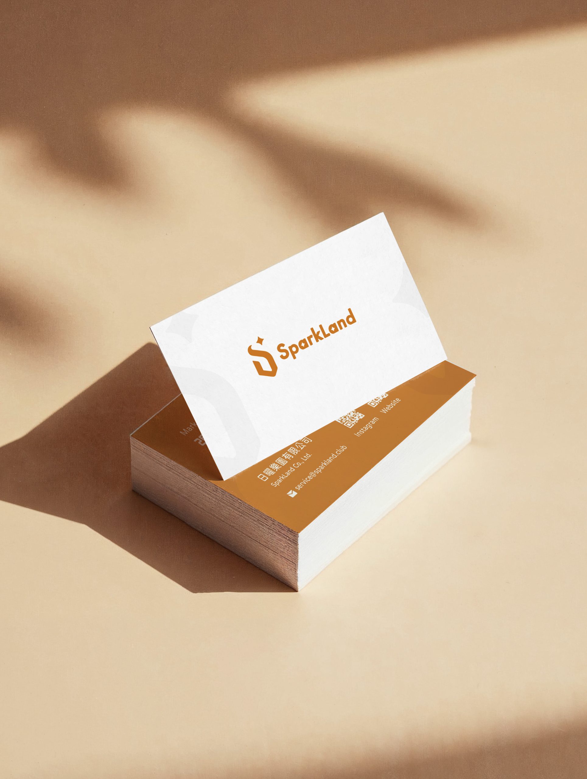
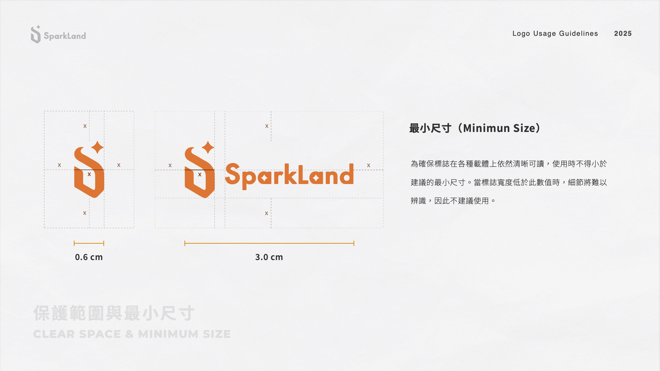
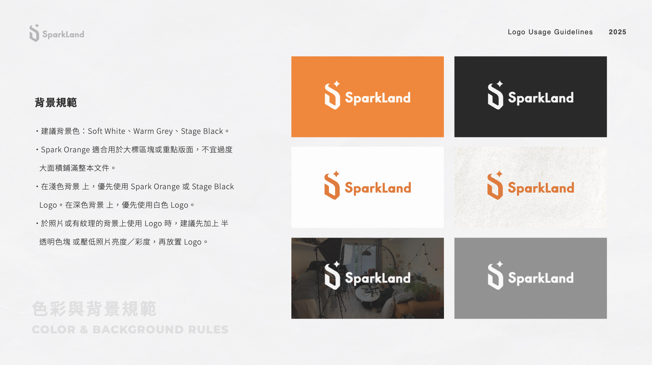
SparkLand’s Visual Identity
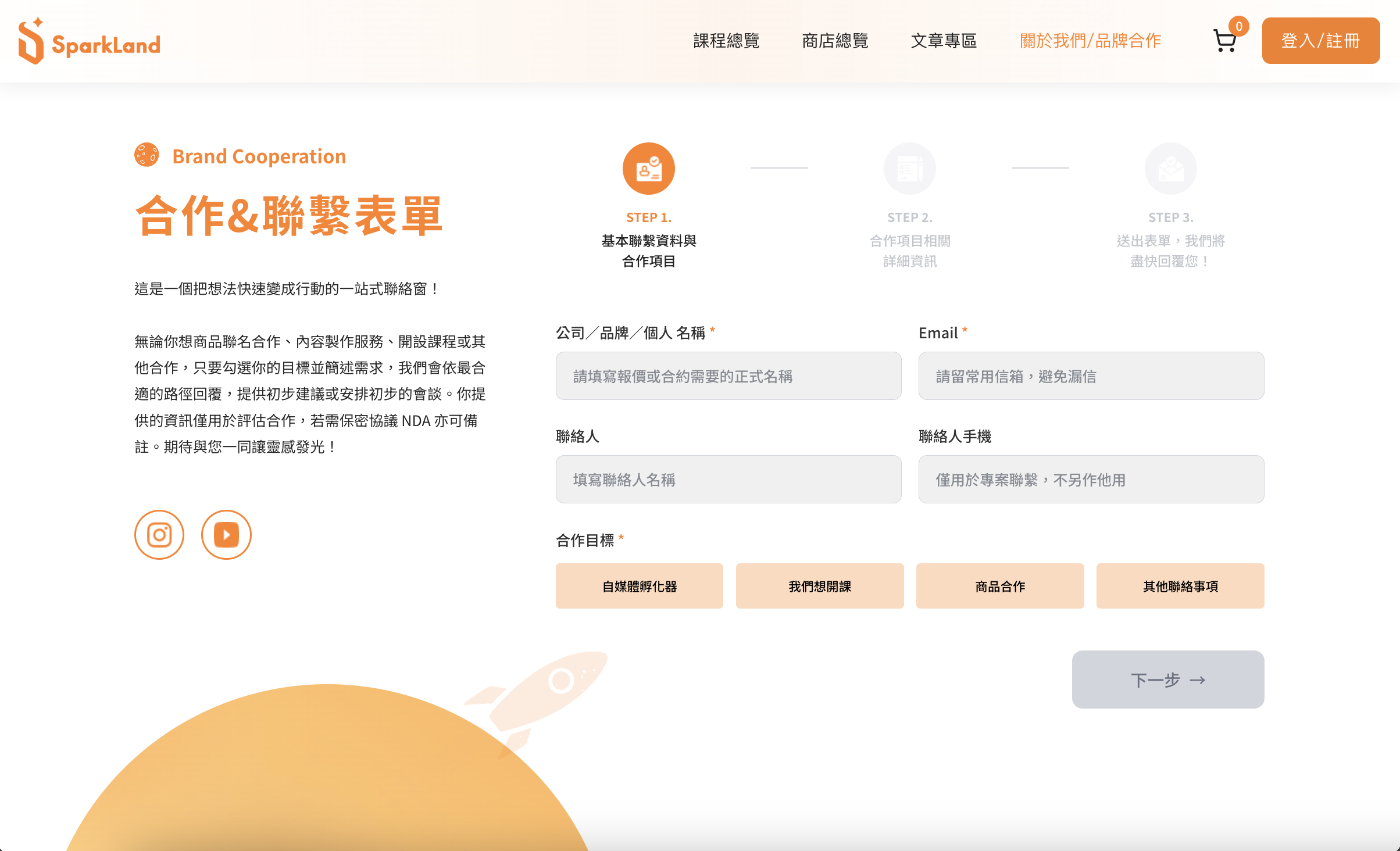
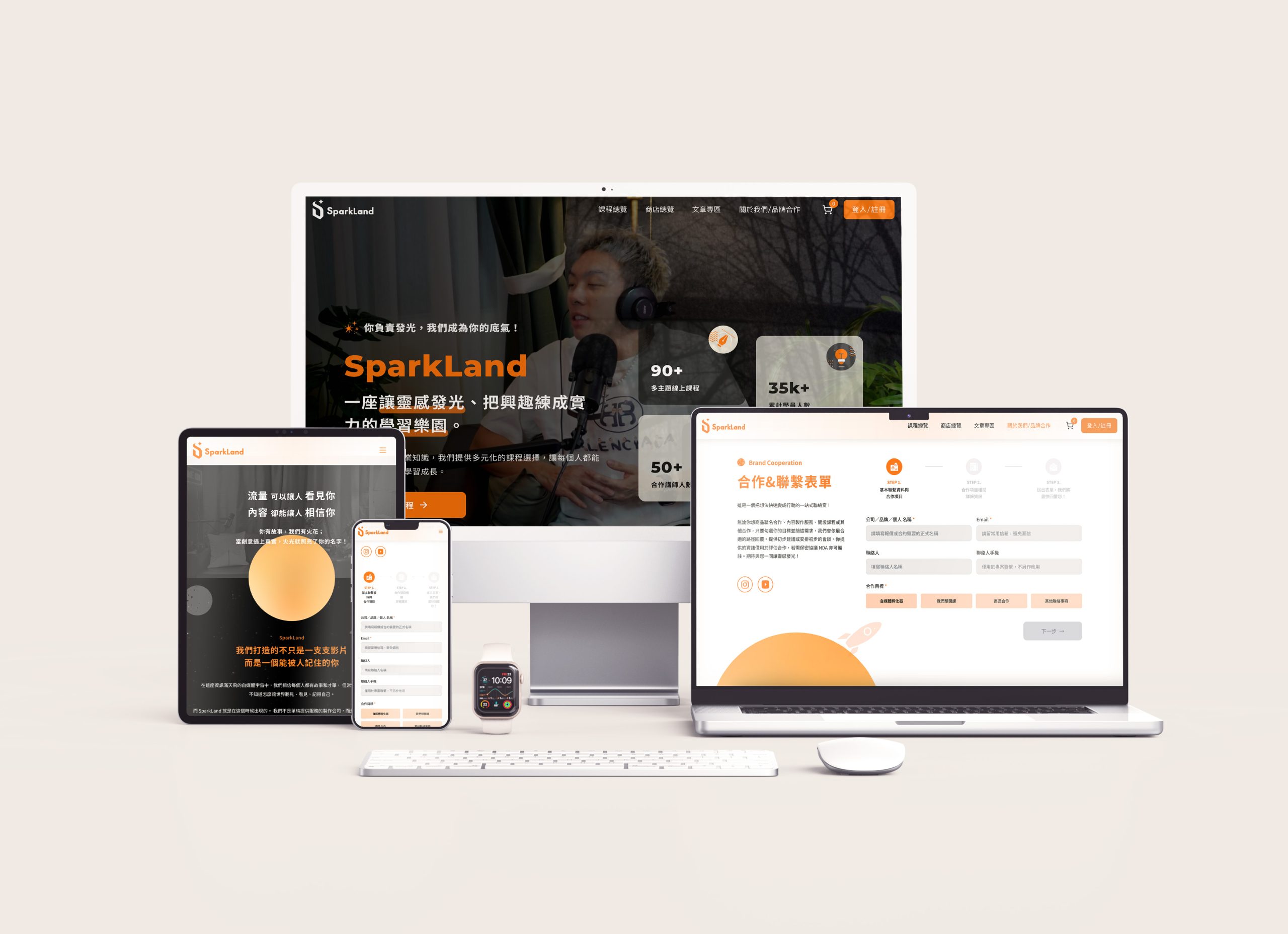
We crafted a brand-new visual identity and website experience for SparkLand, translating the concept of "a spark becoming a planet" into a scalable design system. Visually, we established a professional and memorable brand presence through a clear typographic hierarchy, clean layouts, and a highly recognizable graphic language. On the experience side, we reorganized the information architecture and the pacing of the content so that service packages, portfolio pieces, and collaboration processes can be quickly understood. Ultimately, the SparkLand website is not just a showcase platform; it is a brand portal designed to generate leads, build trust, and support long-term content growth.

03
Backstage
This collaboration centered around the core objective of "Brand Consistency × Conversion Efficiency." We first clarified SparkLand's brand positioning and target audience scenarios to define the homepage's narrative logic and key CTAs (Calls to Action). We then systematized the visual identity, including colors, typography, graphic elements, and component guidelines, to ensure a consistent presentation across social media and the website. Furthermore, we utilized a modular design approach to build a highly maintainable page structure, enabling the team to add new portfolio pieces and update content much more efficiently in the future. The final deliverables include: brand visual guidelines, website information architecture, key page designs with responsive layouts, and scalable UI components and templates.